Groups are used to organize your Galleries and photos. Groups are like folders in your computer or filing cabinet, they are used to hold galleries and organize them into groups or categories.
Please click here for more details on Groups.
Like Galleries, each Group will have its own page on your site. And also like Galleries, the Group's online presentation can be customized with many different options available for the various elements displayed on the page.
To change selected Options for your Group Pages
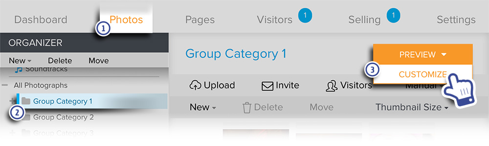
- In your account, go to Photos.
- In the Organizer, select the group you would like to edit.
- Hover the mouse pointer over Preview then click Customize.
For Zenfolio users that signed up after May 10, 2018 please see the updated instructions below:
- In your account, go to Photos.
- Navigate to the desired Group under the Organizer.
- Click on Preview.
- In the Customize view, click on Edit
- Then choose Page from the dropdown menu that appears
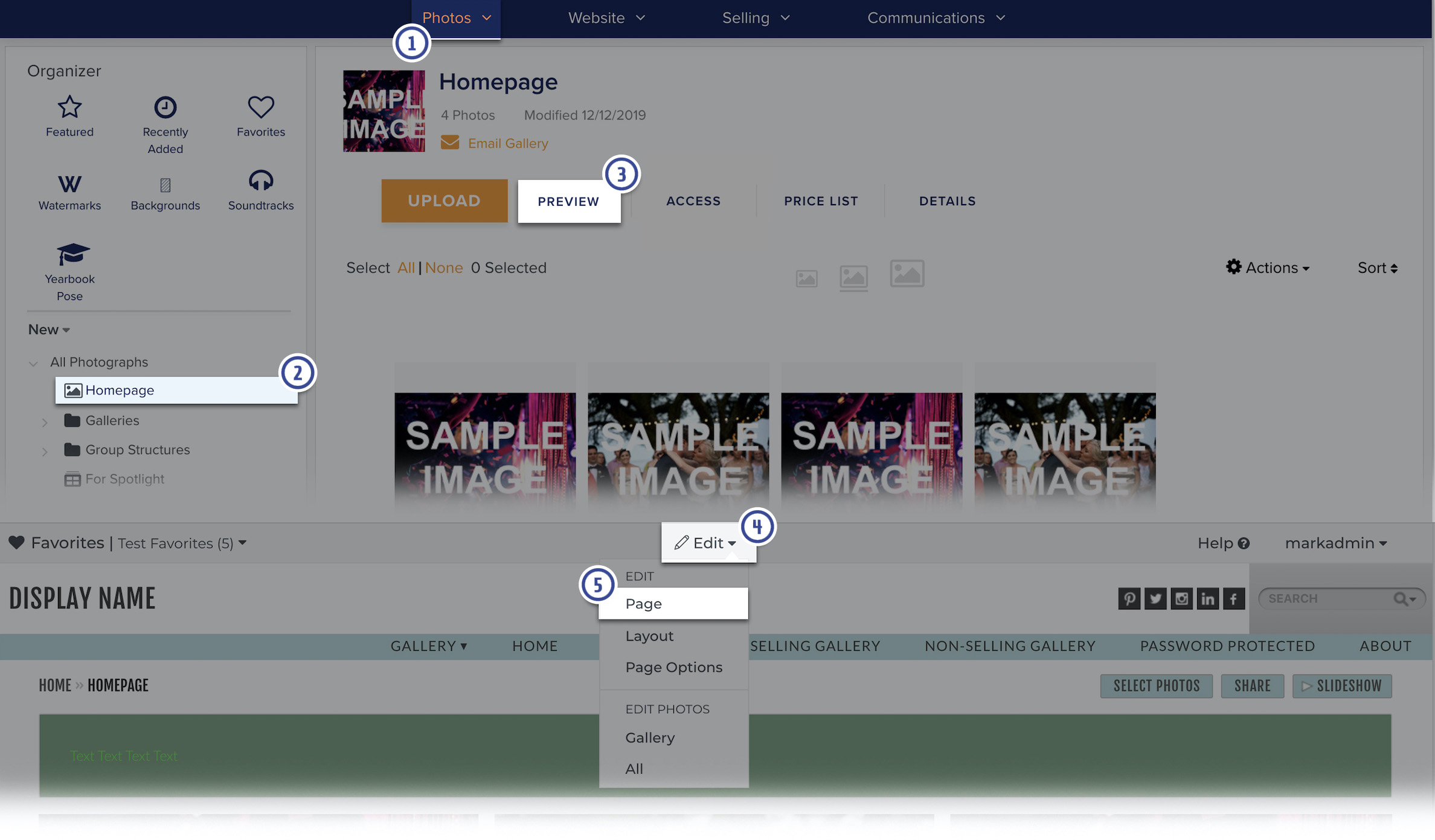
The page will refresh with customization tools displayed at the top, confirming that you are in the customization mode.
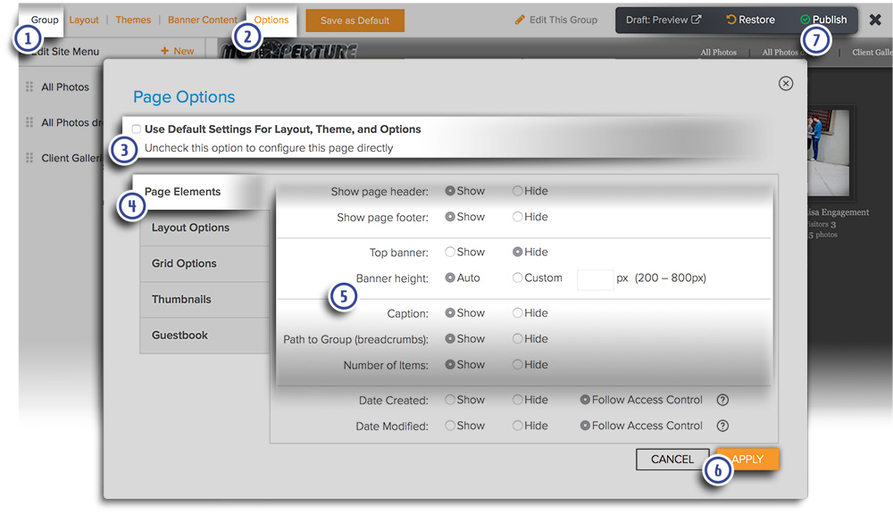
- Make sure that Group is displayed in the top left corner. If not, then a group is not currently selected for editing.
- Click Options in the top menu. A popup window will open.
- Uncheck Use Default Settings for Layout, Theme, and Options if necessary
- Select the tab that contains the option that you would like to configure
- Configure the selected element by setting it to Show, Hide or by entering in a value into the field provided
- Click Apply to confirm and apply the selection. The page will refresh with the new options applied. Review the page with the new options applied. Repeat steps 2 to 6 until you are happy with your changes.
- Click Publish to apply the changes to your live site and exit this mode.
Note: Available elements change depending on the type of visitor page you are customizing and the layout applied to the page.
See the Help section about saving new default website view settings to apply to new pages.
Page Elements
- Show page header – Show or Hide
- Show page footer – Show or Hide
- Top banner – Show or Hide
- Banner height – Auto or Custom size (from 200 to 800 pixels)
- Caption – The description you have created
- Path to Group (breadcrumbs) – The link back to your Home Page and containing group (if applicable)
- Number of Items – The total number of items contained within the group
- Date Created – The date the group was created
- Date Modified - The date the group was last modified
Layout Options
Page width – Dynamic or Fixed
Dynamic will automatically adjust the width of the page to the width of the site visitor's browser window. Elements like the Header and Footer will be stretched to fit the entire width of the browser window.
Fixed will set the page to a fixed width, irrespective of the site visitor's browser window width. Elements like the header and footer will stop at a fixed point.
Grid Options
For your Group pages you will be able to choose a grid style. Each grid style will have its own settings where you can adjust for size and spacing for the grid thumbnails.
Click here to learn more about the dynamic thumbnail grids layouts and their available options.
Thumbnails
The Options displayed in the Thumbnails tab will change based on the Grid Options Style layout selected.
When Grid Style Layouts A, B or C are selected, these options are displayed.
- Text & button placement – You have 6 display options to choose from
- Title – The item name which you can Show or Hide
- Text Alignment – Choose Left, Right, Center or Justify
- Social icons – you can add the various popular social media icons to your thumbnails
- Identifying Overlay Icon – This icon identifies whether the thumbnail relates to a group, gallery or collection
- Access Control Icon – This icon identifies the access control setting as it pertains to public, private, password-protected, etc.
- Number of Items Inside – The total number of available items to view
- Date Created – The date the item was created
- Date Modified – The date the item was last modified
- Number of Visitors – The total of unique visitors
When Grid Style D is selected, the Options below are displayed.
- Choose thumbnails size - The 'Auto' choices will choose a thumbnail size based on the browser window size. Or you can choose the 'Always' choices to force the page to display the selected thumbnails size.
- Display Groups using - For other groups contained by this gallery, you can choose to display the default group thumbnail graphic or the image assigned to the group.
- Title - Displays the Title of the Gallery or Group below the item's thumbnail
- Identifying Overlay Icon - This will display a small icon in the corner of the thumbnail signifying if the item is a group or gallery
- Access Control Icon - Displays a small icon to designate if the gallery is locked or publicly accessible.
- Number of Items Inside - Display the number of items inside the group or gallery
- Date Created - Date the item was created
- Date Modified - Date the item was last modified
Guestbook
- Guestbook - A registry for your visitors to leave comments
- Link to Guestbook – A quick link to the Guestbook
- Number of Guestbook Entries - The total number of Public entries (Private entries are not included)