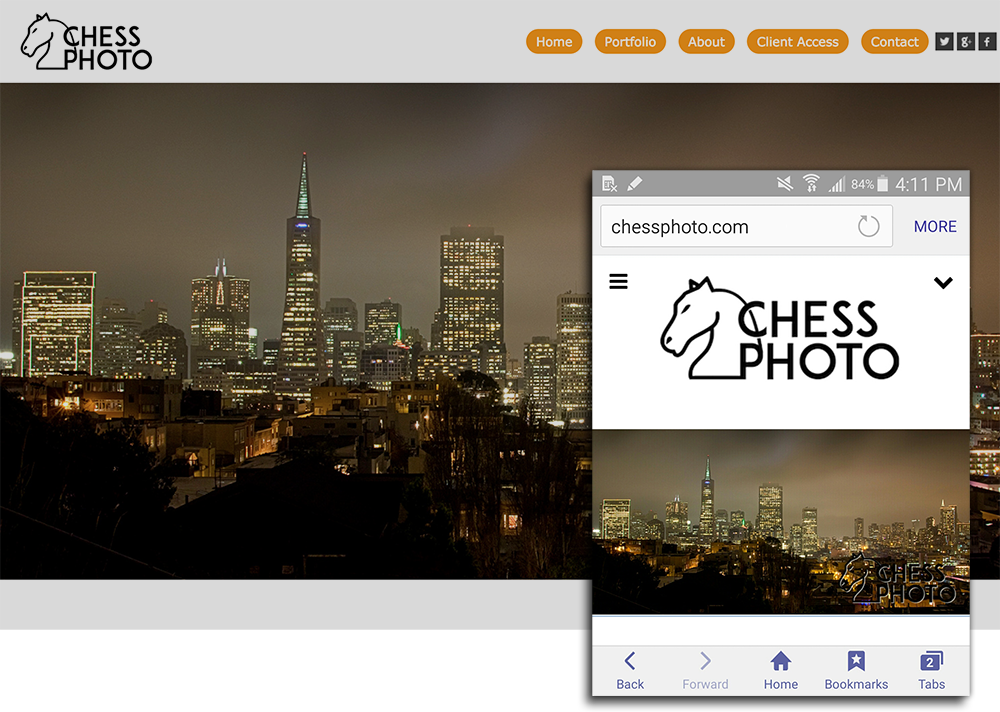
When your Published website is viewed with an Android or iOS (iPhone) mobile device, the mobile version of the site (optimized for display and ease of navigation on small touchscreen devices) is displayed. This is a default setting that can be disabled in Site Settings in the Customize Website view.
Mobile Layout
The overall layout of the mobile site is not user-configurable; it is designed to meet Google's strict standards for a site's mobile friendliness.
This means that it is not possible to adjust the placement of different elements in the mobile site. It is also not possible to apply different layouts to Gallery pages to change the way images are displayed.
Desktop Elements
While customization opportunities for the mobile site are slight, the mobile site does take some design cues from customization settings applied to the desktop version.
-
Site Menu - the same menu items added to the desktop site will be displayed in the site menu on the mobile site. On the mobile site, the site menu is represented by the hamburger icon
in the top left corner of the page.
-
Group and Gallery structure - the same Group and Gallery hierarchy that is applied to the desktop site is applied to the mobile site.
-
Gallery Security - If a Gallery is locked with a password, the password will also be required to view the Gallery in the mobile site. Private Galleries will still be inaccessible to the public in the mobile site, the same as with the desktop site.
-
Visitor Sign in - if the Visitor Sign in is enabled for the Gallery, the visitor sign in will also be requested when the Gallery is visited in the mobile site.
-
Selling - If selling from the desktop version if the Gallery is enabled, then purchases can also be made through the mobile site. Please note that some products are not available for purchase through the mobile site.
Colors and Fonts
The colors and fonts used on the mobile site are controlled by the Theme applied to the desktop version of the site. So, in order to change the colors used in the mobile site, you would simply apply a different theme to the desktop site. The colors and fonts in your new theme will be reflected in the mobile site.
Click HERE to see how to apply different themes to the desktop version of the site.
The colors and fonts used in the mobile site can be further customized by creating a custom theme. Custom themes allow you to choose your own colors and fonts for almost all elements displayed in the site. By creating a custom theme (or editing an existing custom theme) and applying it to the desktop version of the site, you can manually choose the colors and fonts in the mobile site.
Click HERE to see how to edit a custom theme.
Please note that while different fonts can be applied, the sizes of the fonts in the mobile site are predetermined and cannot be directly customized.
Changing the Mobile Logo
If you are a Pro or Advanced subscriber, you have the ability to use your own Logo.
The logo displayed in the mobile site will be the same as the logo uploaded to the account's Mobile Logo. This allows you to display a different sized logo or logo design for visitors using a mobile device.
For the mobile logo, you can upload a JPEG, GIF, PNG, or TIFF file. We recommend using a PNG file with transparency up to 640 pixels in width and 200 pixels in height.
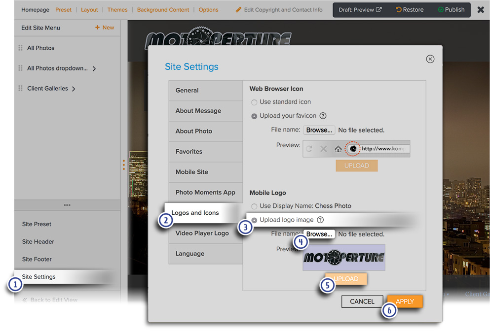
The mobile logo is uploaded through Site Settings panel in Customize Website View. See this link for how to access Customize Website View.
-
Once in Customize Website View, click on Site Settings on the left.
-
Go to the Logos and Icons tab.
-
Click to select Upload logo image.
-
Click Browse to select the desired file from your computer.
-
Click Upload.
-
Click Apply to apply your changes.
When you are done customizing click, PUBLISH to confirm you’d like your changes to be live.
For our recommendations and tips on creating and preparing a great looking logo for your site, please click HERE.